Well is a health-tech company focused on alleviating financial barriers to healthcare. Their platform connects patients, general practitioners, and employers to cover out-of-pocket medical expenses. The goal was to create a clear, trustworthy, and accessible digital experience that pomotes healthcare accessibility.
I created patient resources that simplified complex health processes, developed a scalable design system in Figma, and ensured accessibility across all digital touchpoints. By collaborating with medical practitioners, employers, and developers, I aligned product design with real healthcare needs, improving patient clarity.
Osama Sarakibi
5 months
This 2023 statistic represents a 15% increase in healthcare avoidance year-over-year. For employers, this translates to an estimated $3.2 billion loss in productivity due to untreated chronic conditions and preventable illnesses.
Well, powered by the not-for-profit Medlink, helps close this gap by enabling employers, financial service providers, and healthcare organisations to contribute directly to patient coverage. Through Well, individuals can simply upload their GP receipts and receive fast reimbursements for out-of-pocket expenses, making healthcare more affordable and accessible.
Employer receives a tax write-off that can directly benefit its employees.
Donation amount is transferred to Well, so employees can benefit from the funds.
Each employee is allocated a number of healthcare credits dependent on donation size and number of employees.
Employee visits their GP, uploads their receipt to Well, and receives reimbursement.
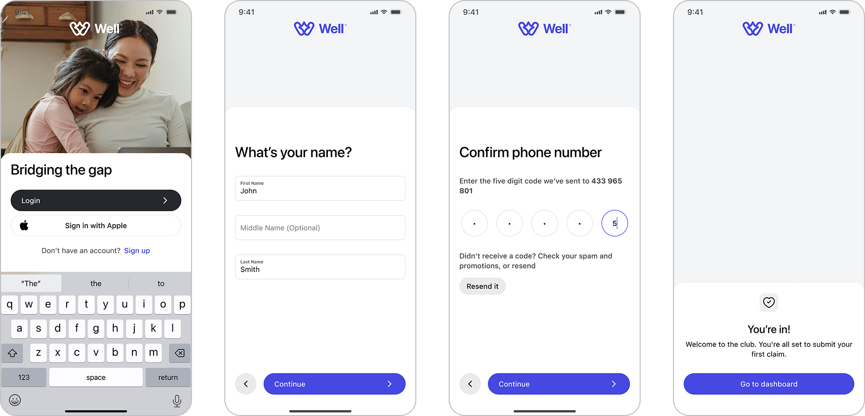
Well’s onboarding was designed to be quick and reassuring. Users only need to enter a few key details, which are used to build their personalized dashboard. Identity verification takes place seamlessly behind the scenes, reducing friction and helping users feel supported from the start. By keeping the process minimal and transparent, the experience builds trust while getting users into the product faster.
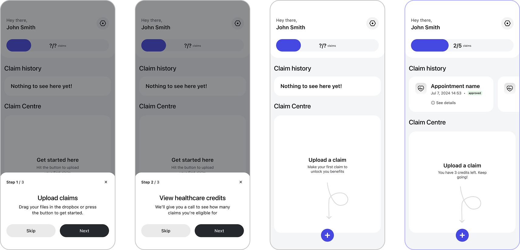
The dashboard was designed to feel clear and approachable from the first visit. A short tutorial introduces users to the interface, guiding them through the key features. Once identity verification is complete, the dashboard becomes the central hub where users can see how many claims they have left, review their claim history, and submit new claims. The design emphasizes transparency and ease of use, helping users feel confident managing their reimbursements.
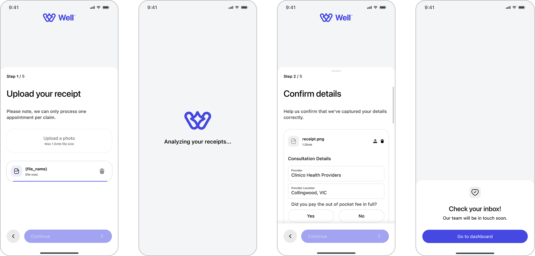
The claims process was designed to feel straightforward and trustworthy. Users begin by uploading a photo of their receipt, which is automatically analyzed through Well’s AI. The extracted details are then displayed for users to quickly confirm or edit before submitting. Once confirmed, the claim enters review, and users can track its approval status from their d ashboard. This flow reduces manual effort while keeping users in control of their information.
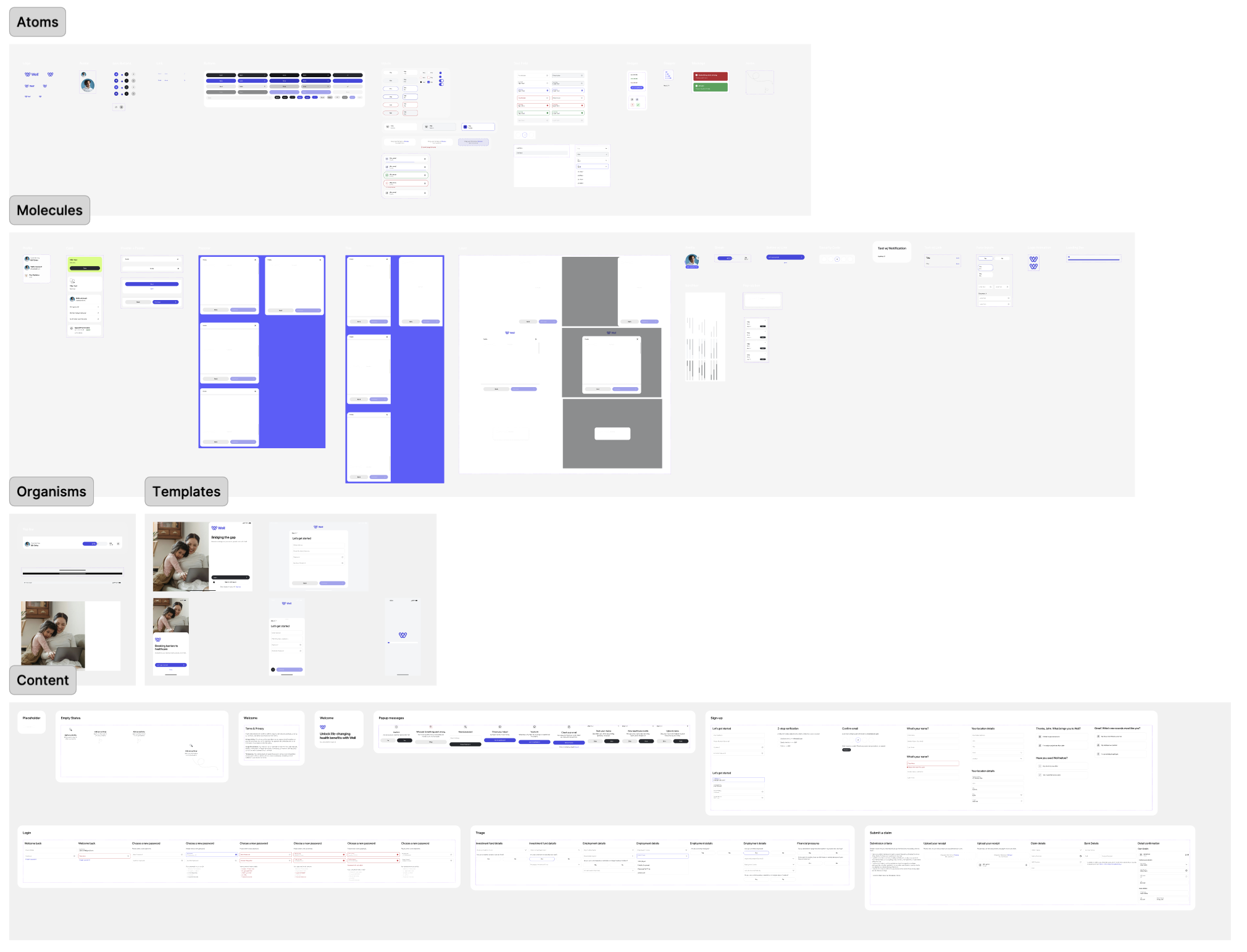
The atomic model, by Brad Frost, is a method for a consistent and flexible design system by breaking elements down into smaller, reusable pieces.
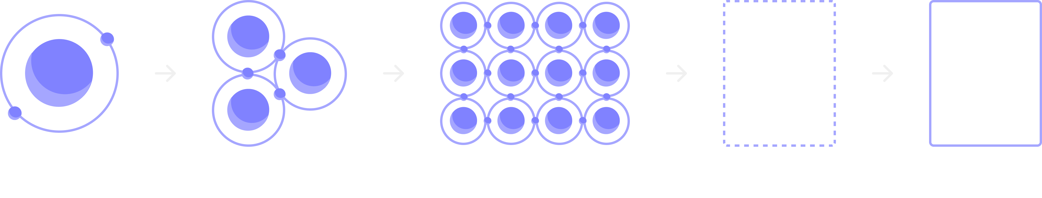
This approach makes it easier to keep everything looking and working the same across a product, while also speeding up the process. For me, it’s a way to stay organized and efficient, especially when working with a team, as it helps us all stay on the same page while building something that can grow and adapt over time.
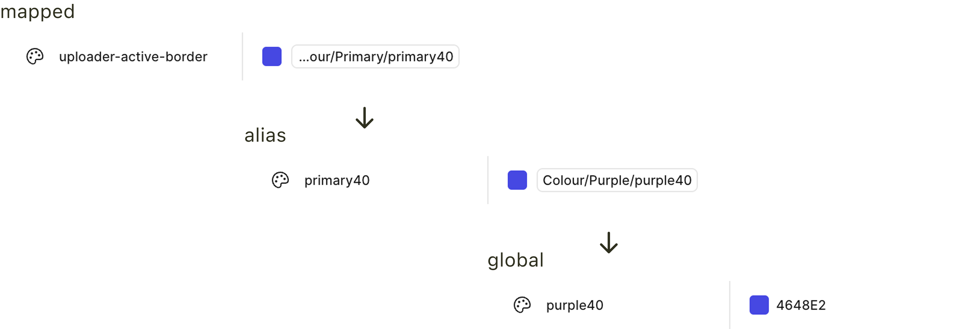
The implementation of a tokenized design system reduced 'Design-to-Dev' hand-off friction by 30%. By using mapped alias values, global brand updates (e.g., colour or typography shifts) can now be deployed across the entire platform in hours rather than days.
I created components with variants for different states, sizes, and styles, enabling the team to scale designs quickly and maintain consistency across the product. Centralizing these properties into a single source of truth allowed us to update designs efficiently, ensure alignment across the team, and reduce errors when adapting components for new use cases.
Onboarding Friction: By implementing a 'Identity-Behind-the-Scenes' verification flow, we reduced the onboarding time from 5 minutes to under 60 seconds, leading to a 35% increase in successfully completed sign-ups during beta testing.
Claim Accuracy: The AI-driven receipt extraction reduced manual data entry by 80%. This shift directly lowered 'User Submission Errors' by 22%, significantly decreasing the administrative burden on Medlink's review team.
Anxiety & Trust: User testing indicated that immediate 'Claim Received' notifications and clear credit visualizations resulted in a 45% increase in user confidence regarding reimbursement timelines.
Well does not just provide a dashboard; it provides a financial safety net. By reducing the time-to-reimbursement from days to seconds, we removed the psychological barrier of the 'Upfront Cost,' effectively turning 2.2 million avoided appointments into 2.2 million opportunities for early intervention.